


How Do You Report on Training Engagement Without Exporting Another Spreadsheet?
.png)
TL;DR
Quick Summary: Training Engagement Reporting
Training engagement reporting is the practice of measuring how deeply learners participate in and apply a program, using consolidated platform data instead of manually merged spreadsheet exports. Up to 67% of companies cannot prove the business impact of their training, largely because completion, attendance, and survey data live in disconnected systems.
5 Key Takeaways:
- Spreadsheet Limitations: Manually combining LMS completion counts, Zoom attendance logs, and survey results produces reports that are labor-intensive, inconsistent, and stale on delivery.
- Measurement Confidence Gap: Only 29% of L&D leaders feel confident proving ROI, and 87% of organizations struggle to isolate training impact, according to ATD and Brandon Hall Group research.
- Outcome-Linked Metrics: Engagement scores, time to competency, and post-program skill application answer leadership's ROI question more directly than completion rates or login counts.
- Granular Program Analytics: Program-level reports should break out per-member curriculum completion, content-level drop-off, and actual event attendance versus RSVPs.
- Multi-Level Visibility: Pathway, member, and group-level reports enable cohort monitoring and per-customer progress tracking, with scoped access for group leads.
Up to 67% of companies cannot prove the business impact of their training programs, and only 8% of L&D professionals feel highly confident in their ability to measure it. That gap does not exist because L&D teams do not care about data. It exists because most of them are stuck manually assembling it.
If your version of "reporting" involves pulling completion counts from your LMS, attendance logs from Zoom, and survey scores from a separate form, then pasting all three into a spreadsheet before every leadership update, you already know how much time that costs. And you know how fast it goes stale the moment someone asks a follow-up question.
The real cost of manual training reports
The instinct to default to spreadsheets is not a personal failing. It is what happens when your data lives in several systems that were never designed to talk to each other, and by the time someone reconciles it by hand, the moment to act on it has often passed. Research suggests roughly 90% of L&D organizations struggle to demonstrate clear business value from their programs for exactly this reason.
Manual reporting eats hours every week, the resulting reports are already outdated by the time they reach a stakeholder, and no two team members calculate the same metric the same way.
Why completion rates keep failing the confidence test
Most teams do not lack data. They lack the confidence that their data means anything. Only 29% of L&D leaders say they feel confident proving ROI to leadership, even as most rate their own analytics skills as strong.
That disconnect points to a metrics gap, not a skills gap. Completion rates and login counts show that something happened. They do not show whether it worked. Research from ATD and the Brandon Hall Group backs this up: 87% of organizations struggle to isolate the actual impact of their training, and fewer than 16% can identify metrics tied to real business outcomes.
Pressure to fix this is rising fast. Nearly three-quarters of L&D teams expect flat budgets this year, while 64% say leadership now expects proof of impact and 72% report being asked to justify spend more rigorously than in past years. At the same time, 58% of L&D professionals say they are too busy running programs to step back and think strategically about any of it.
The metrics that actually answer leadership's question
Executives are not asking how many people logged in. They are asking whether the investment changed anything. Closing that gap starts with a small set of metrics that connect activity to outcomes:
None of these require a new spreadsheet tab. They require a system that already knows who engaged, how deeply, and what happened next, without anyone manually reconciling five exports first.
Take a simple example: a leadership team asks which cohort in a 6-week onboarding program is falling behind. In a spreadsheet-based setup, that question means exporting attendance from one tool, completion data from another, and cross-referencing both against a roster in a third, usually the night before the meeting. In a system built to answer the question directly, it's a filter on a dashboard that already shows the percentage of members who have started the curriculum, average curriculum progress, and who is active versus who has gone quiet. The difference is not the sophistication of the metric. It's whether the platform was built to surface it without a human doing the stitching.
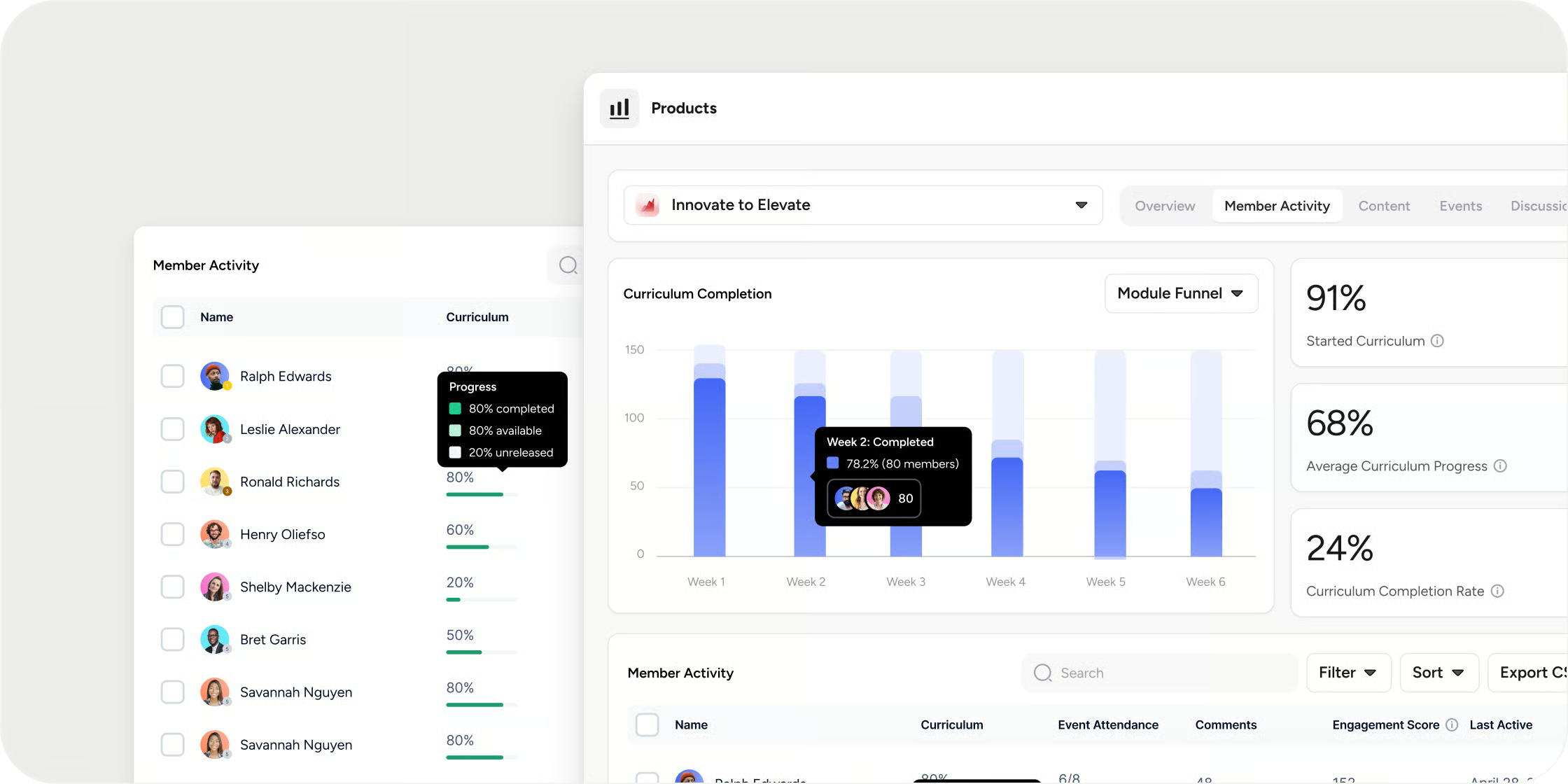
How Disco solves this
Disco builds this kind of reporting into the platform itself, at three levels, so the numbers update in real time instead of waiting on a manual pull.
At the program level, a Product Report gives you total earned revenue, number of registered and active members, and average engagement score at a glance, then lets you go as deep as a per-member table showing curriculum completion, attendance, comments, and last active date. The Content tab shows the percentage of total content viewed and breaks out completion rate and views for every video, survey, assignment, and quiz, so you can see which specific lesson is losing people, not just that completion dipped overall. For live sessions, the Events tab separates the percentage of members who confirmed attendance from the percentage who actually showed up, a gap most spreadsheet trackers never catch because they only log the RSVP.
Zoom out and a Pathways Report shows momentum across an entire multi-program Pathway: total members registered, how many were active in the last 7 days, and the average completion rate across the whole sequence. Pair it with the Member Report's Programs tab, which shows each member's enrollment date, current progress, engagement score, and time spent, and you go from "the cohort is slipping" to "here is exactly who to reach out to and where they got stuck."
For teams managing multiple customers or teams inside one academy, Group Reports scope all of this down to a single group, with a Member Progress Report, an Aggregate Member Report, and a Products Report available for that group alone. Group Leads can be given access to their own group's numbers without seeing anyone else's. If you are selling the same program to several customers, that means per-customer progress reporting without standing up a separate program for each one.
What this looks like without the spreadsheet
Teams that get this right are doing less reporting work, not more, because the reporting lives inside the same platform members are already learning in. A leadership update becomes a matter of opening a dashboard instead of rebuilding one from five exports.
If your team is still exporting spreadsheets to answer basic questions about who is engaged and who isn't, the fix is rarely "track more things." It's making sure the platform you're already using is built to answer those questions on its own.


